Uncategorized
How to Prepare a Flawless Print-Ready PDF for Your Book
So, you’ve finished writing your book, designing your annual report, or compiling your family memoir. Congratulations! The hard part is over. Now comes the exciting part: turning that digital file into a physical book.
However, moving from a screen to paper can be tricky. A file that looks perfect in Microsoft Word or Canva might have issues when it hits a professional digital press.
At BookPrintCanada, we want your books to look exactly how you imagined them. To help you avoid common delays and quality issues, we’ve put together this essential guide on creating a print-ready PDF.
1. Why PDF? (And Not Word or PowerPoint)
We prioritize PDF (Portable Document Format) files for one simple reason: Consistency.
When you send a Word document, the fonts might shift, or the layout might break depending on the computer version we use. A PDF locks everything in place. It ensures that what you see on your screen is exactly what we print on our machines.
Pro Tip: Always choose “High-Quality Print” or “Press Quality” when exporting your PDF from your design software.
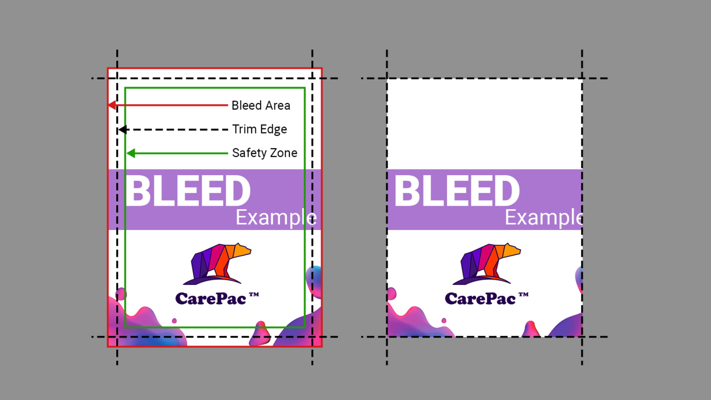
2. Understanding “Bleed” (Crucial!)
This is the #1 error we see in new orders.
If you want your images or background colors to extend all the way to the edge of the paper (no white border), you must include Bleed.
- What is Bleed? It is an extra 0.125 inches (1/8″) of artwork that extends beyond the final trim size.
- Why do we need it? Paper can shift slightly (less than a millimeter) during the trimming process. Bleed ensures you don’t end up with a hairline white edge on your page.
Example: If your book is 8.5″ x 11″, your PDF file size including bleed should be 8.75″ x 11.25″.
3. Respect the “Safe Zone”
Just as you need to extend artwork outside the page, you need to keep text and important logos inside the safe zone.
Please keep all text at least 0.5 inches away from the edge of the paper. This is especially important for the gutter (the inside margin where the book is bound).
- Perfect Binding (Glue): Requires a larger inside margin so text doesn’t get swallowed by the spine.
- Coil Binding: Needs room for the holes to be punched.
4. Image Resolution: 300 DPI is the Magic Number
Images downloaded from the web are usually 72 DPI (Dots Per Inch). They look great on a phone screen but will look pixelated and blurry when printed.
For professional book printing, ensure all your images are at least 300 DPI.
- Check: Zoom in on your PDF to 300%. If the image looks blocky on screen, it will look blocky in print.
5. Convert Colors to CMYK
Digital screens use RGB (Red, Green, Blue) light to create colors. Printers use CMYK (Cyan, Magenta, Yellow, Key/Black) ink.
Since we are a CMYK digital printing shop, we recommend converting your colors to CMYK before exporting your PDF.
- Note: Bright neon colors (like glowing lime green) in RGB cannot be perfectly reproduced in standard CMYK printing. They may appear slightly duller on paper. Checking this beforehand helps manage expectations.
6. Embed Your Fonts
Have you ever opened a file and seen the text replaced with strange symbols? That happens when fonts aren’t embedded.
When saving your PDF, ensure the setting “Embed All Fonts” is checked. This guarantees that your beautiful serif font stays exactly as you designed it.
Ready to Print?
Preparing your file correctly saves you time and ensures your project runs smoothly through our digital presses.
If you are unsure about your file, don’t worry. At BookPrintCanada, we offer a file check service to catch these issues before we hit the print button.
Have a project in mind?
[> Get a Free Quote Today]